Case study · Restaurant brand identity
Taco Saint
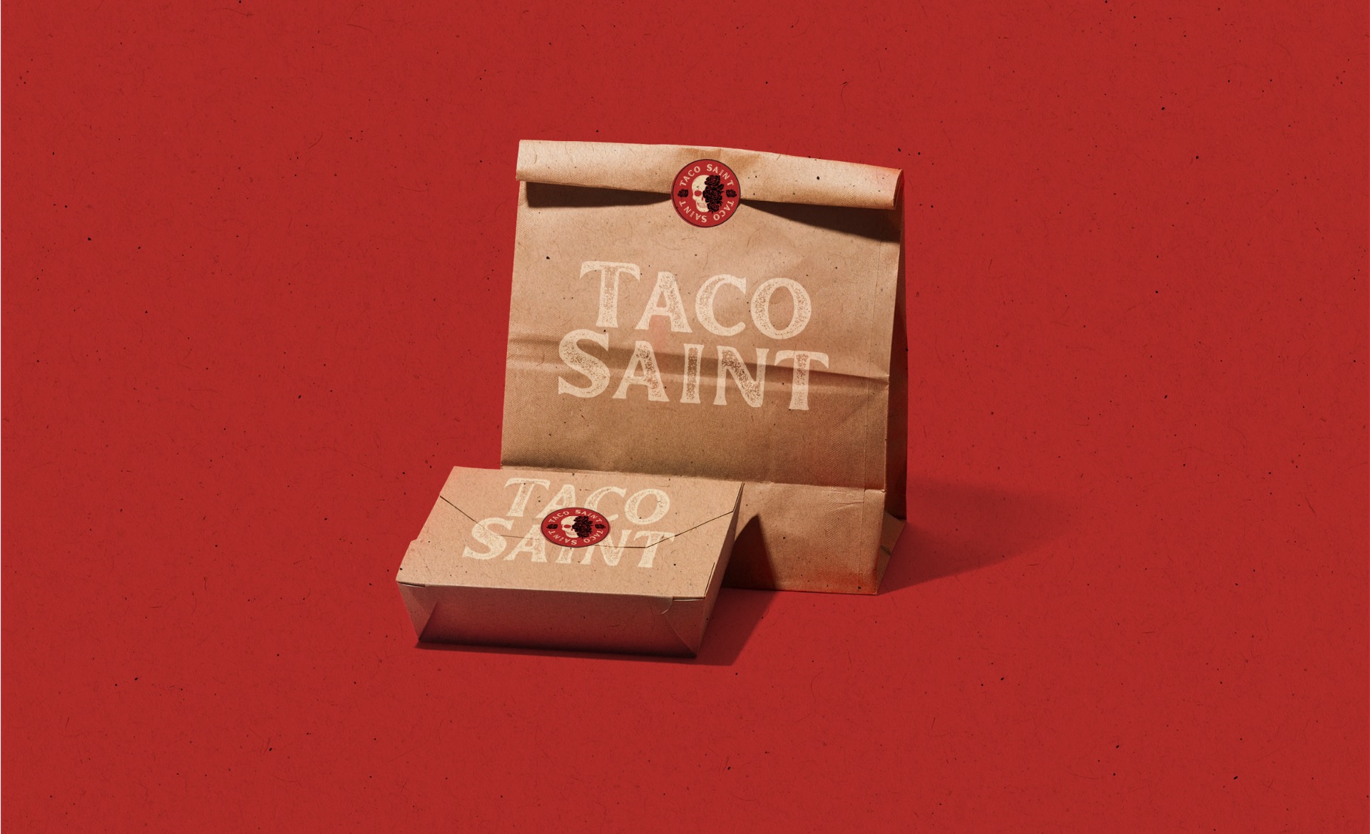
A taco concept with a satirical, unapologetic streak, raising money to open its first location in Utah. Before there was a kitchen, there had to be a brand people could believe in.
- Client
- Taco Saint Street Food
- Industry
- Restaurant
- Location
- Utah
- Scope
- Visual identity, packaging, social, merch
The challenge
A restaurant that doesn’t exist yet has one thing to sell: the idea. Taco Saint needed a brand that made investors see a real business and made the right crowd want to line up for it.
The personality was already there. Bold, irreverent, a little sacrilegious. It just had nowhere to live yet.
The approach
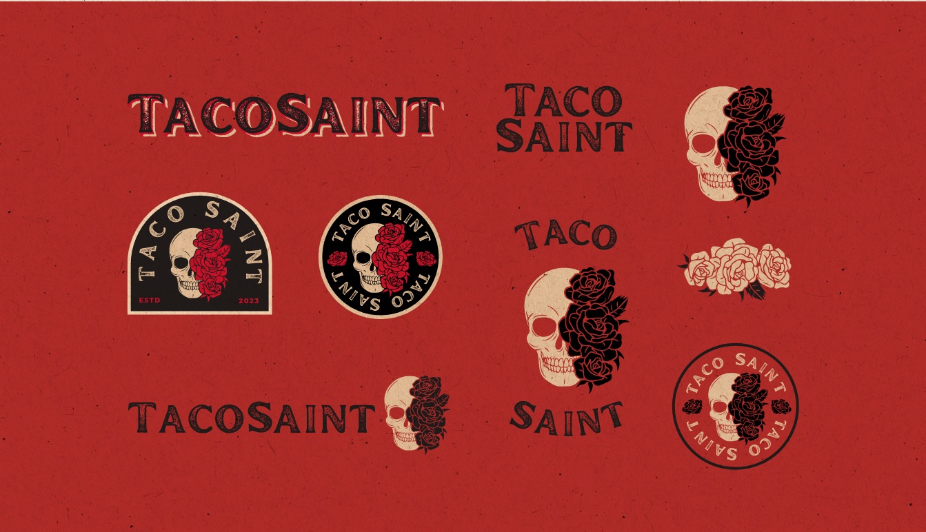
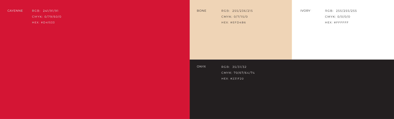
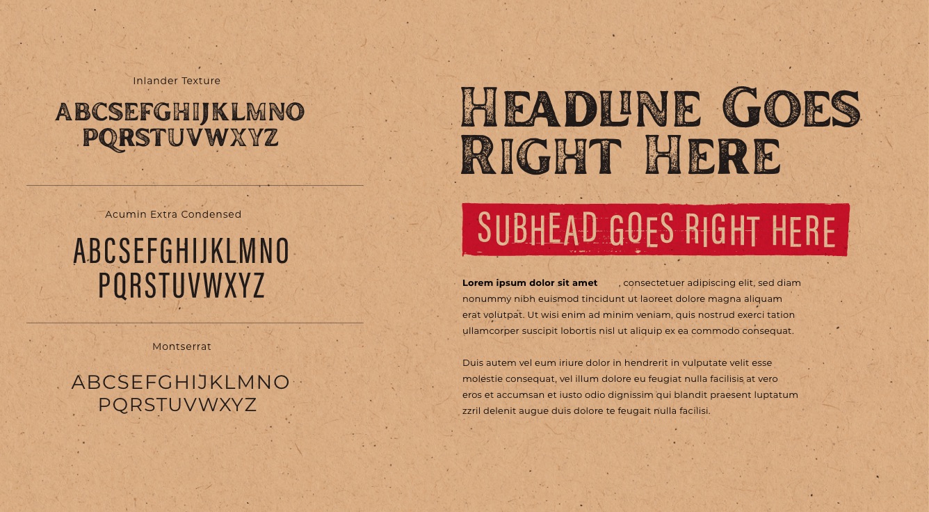
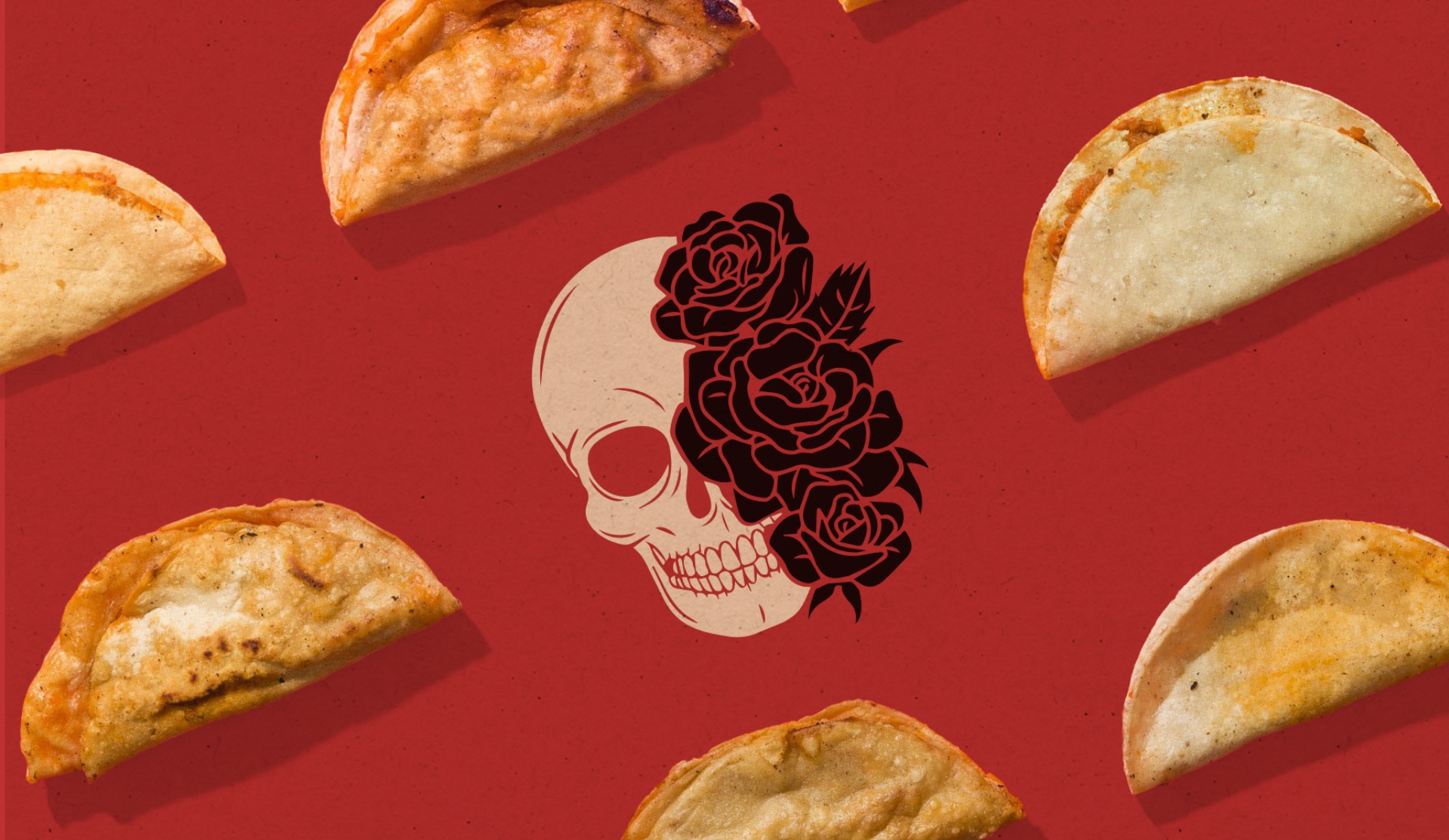
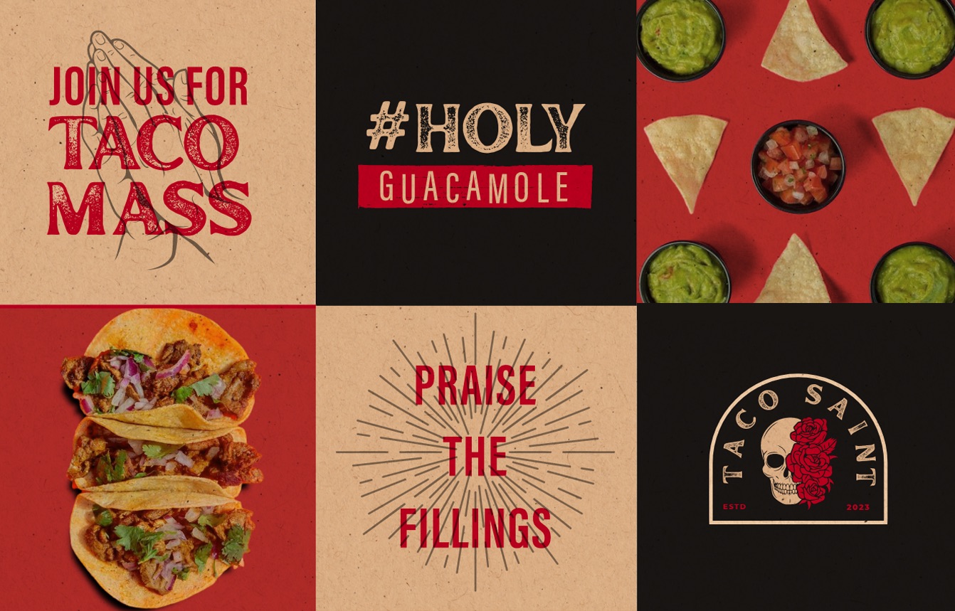
I built the identity around one tension: reverence and rebellion. A skull crowned in roses. Worn, hand-pressed type. A palette of cayenne, bone and onyx.
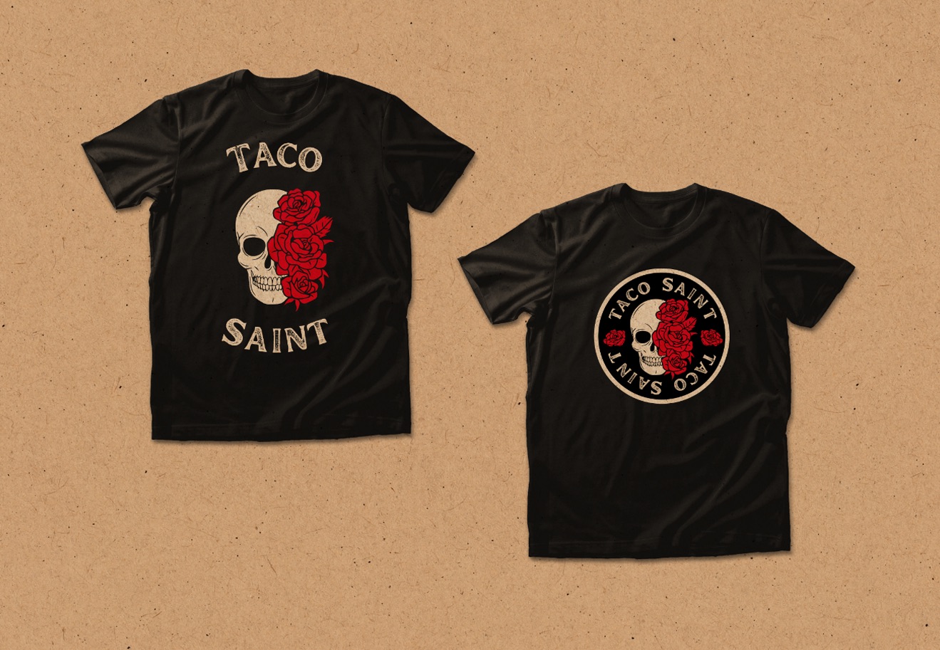
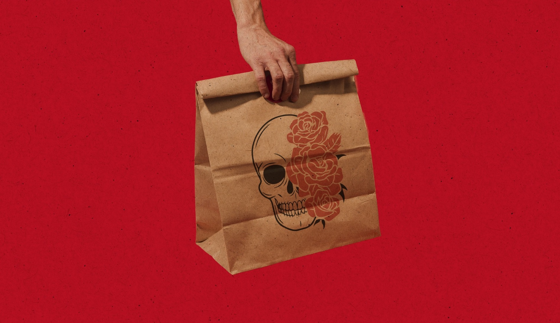
Then I pushed it into every place the brand would show up, from takeout bags and shirts to a social voice that turns church language into taco language.
Has your company outgrown its brand?
Let’s close the gap between the level you’re playing at and how you show up.