Case study · Wellness rebrand
Swish Aesthetics
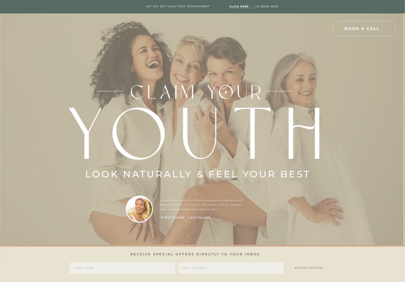
An esthetics studio fighting a stigma: that aesthetic treatments make you look less like yourself. The rebrand had to prove the opposite before a client ever booked.
- Client
- Swish Aesthetics
- Industry
- Esthetics & wellness
- Location
- Queen Creek, AZ
- Scope
- Rebrand, visual identity, website, print
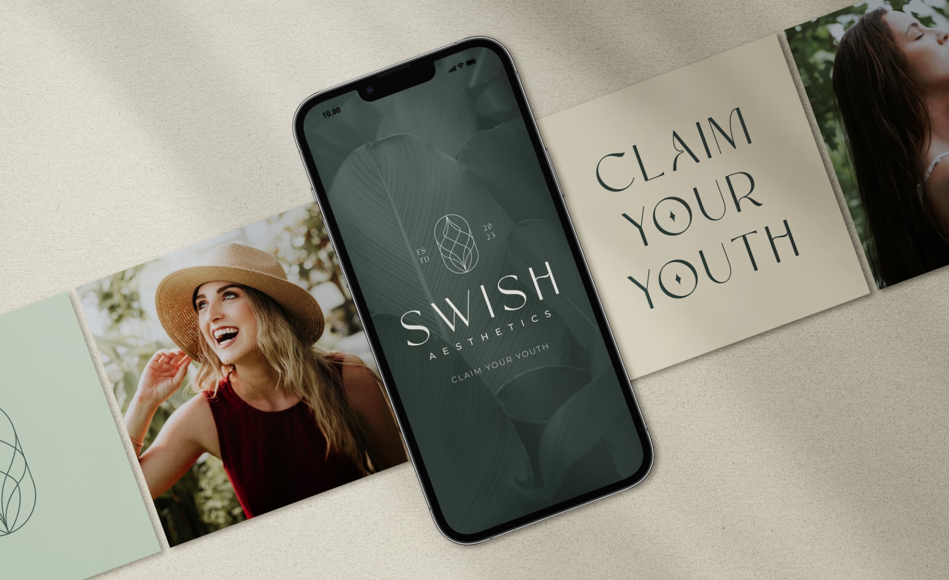
The challenge
Most aesthetics brands look clinical: white walls, cold blues, before-and-after photos. That look feeds the exact fear Swish was trying to dispel.
Their work was built on natural ingredients and a holistic approach. Nothing about their brand said so.
The approach
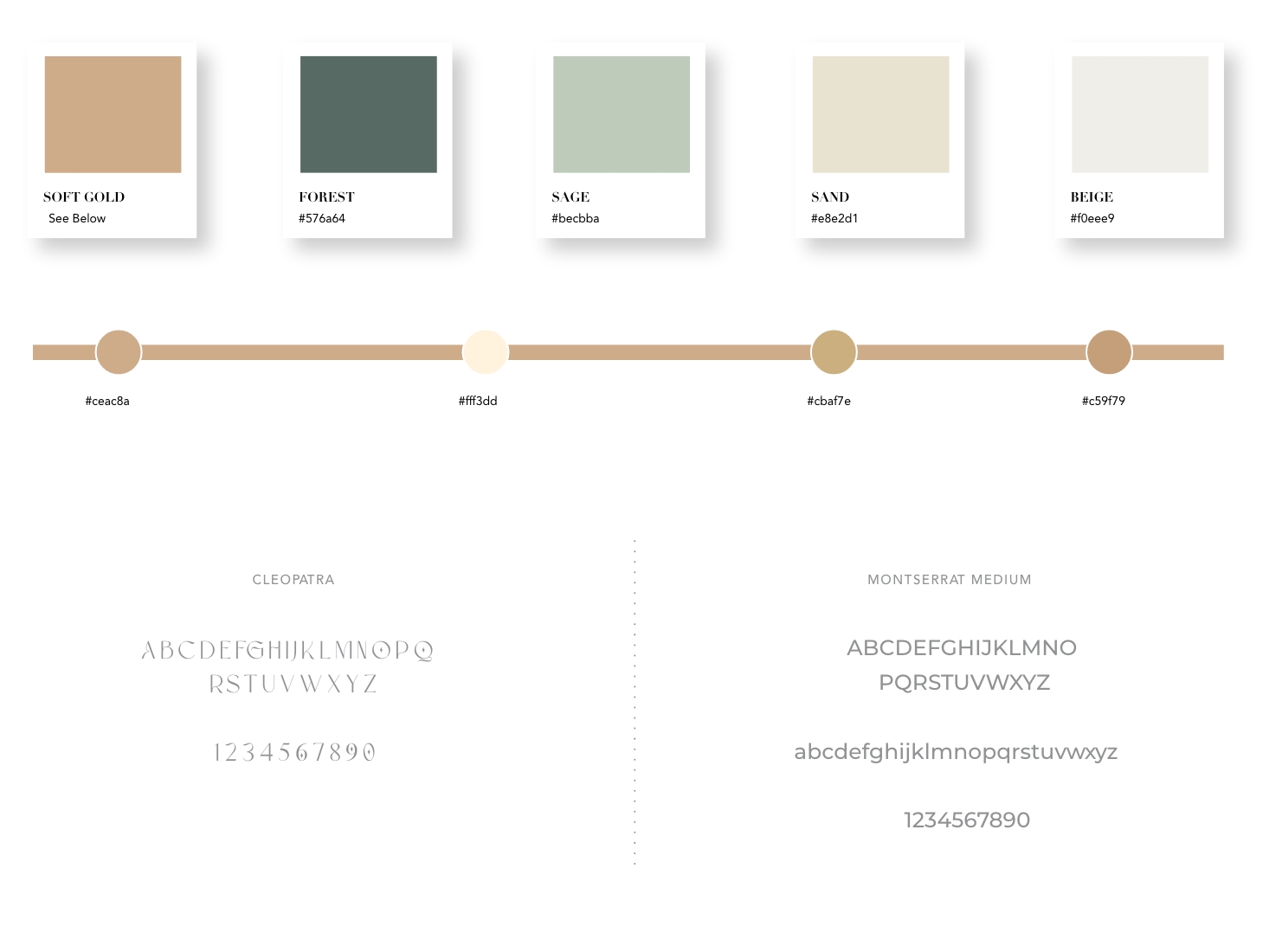
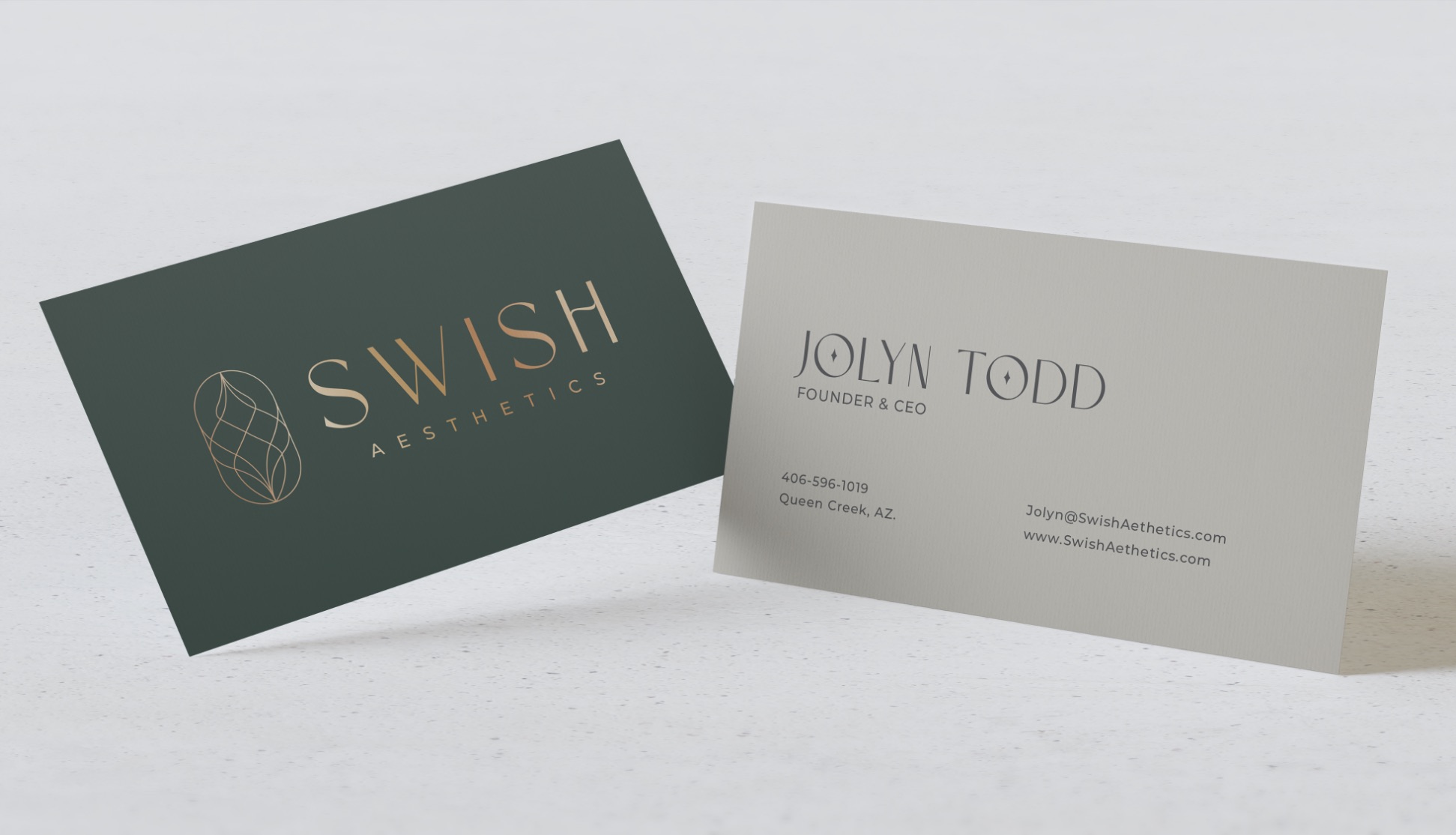
I took the brand out of the clinic and into nature. Forest, sage and sand in place of sterile white, with soft gold for warmth.
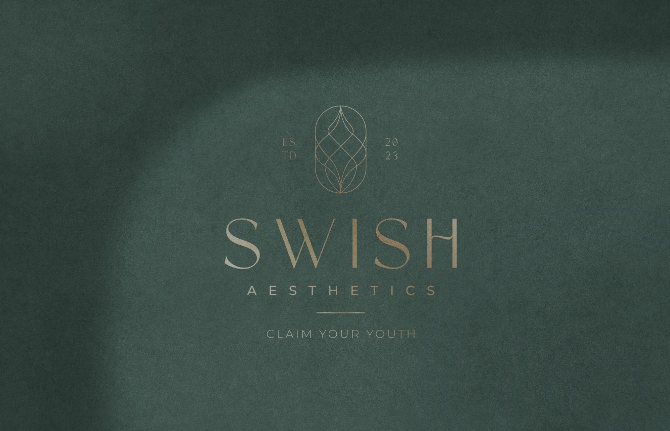
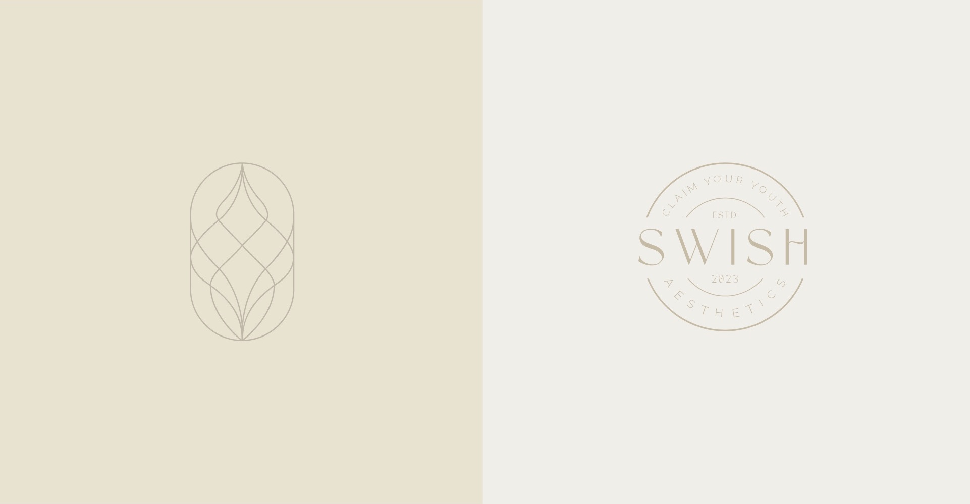
The mark joins three ideas in one continuous line: the S of Swish, the precision of the treatment, and a lotus for natural care. The promise became the tagline: Claim your youth.

Has your company outgrown its brand?
Let’s close the gap between the level you’re playing at and how you show up.