Case study · Restaurant brand identity
Pith & Pally
A St. Pete restaurant built on curiosity: communal tables, strangers side by side, and a menu you don’t see in advance. The brand had to make the unknown feel like an invitation, not a risk.
- Client
- Pith & Pally
- Industry
- Restaurant
- Location
- St. Petersburg, FL
- Scope
- Visual identity, signage, packaging, merch
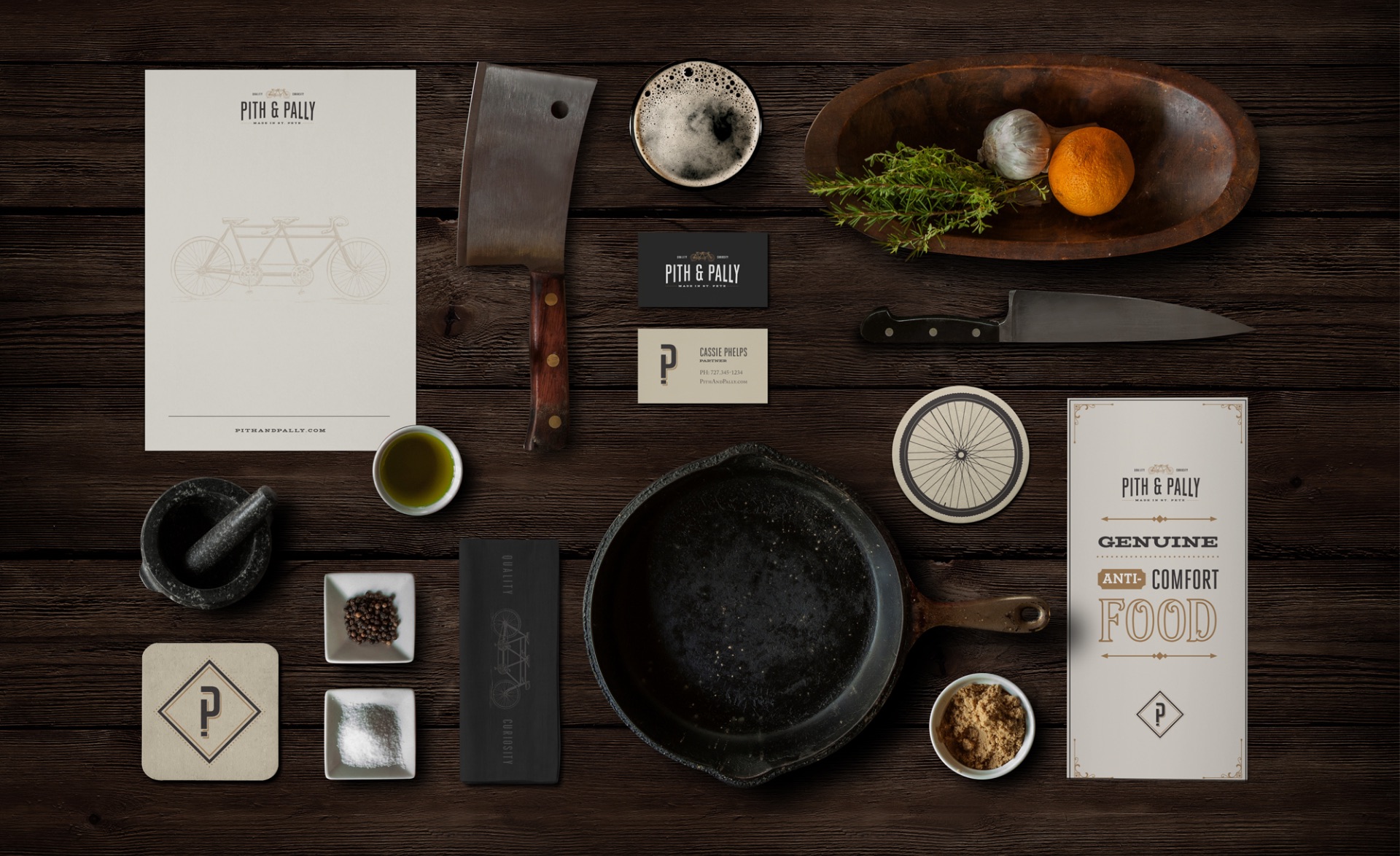
The challenge
Pith & Pally asks guests to give up the two things most restaurants promise: a familiar menu and a table to themselves. That’s a hard sell from a brand that looks like everyone else’s.
It needed to signal quality strongly enough that people would trust the mystery.
The approach
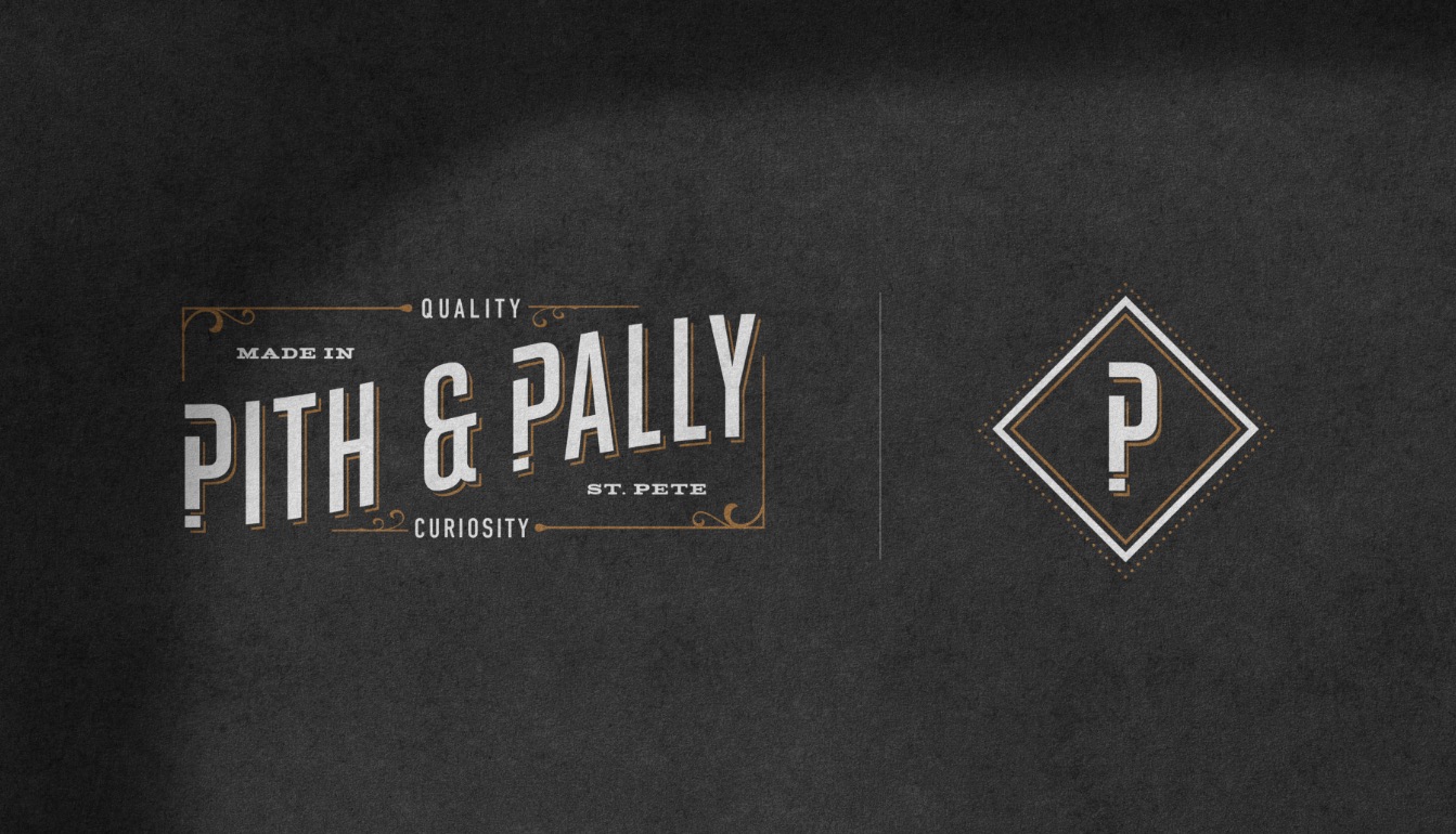
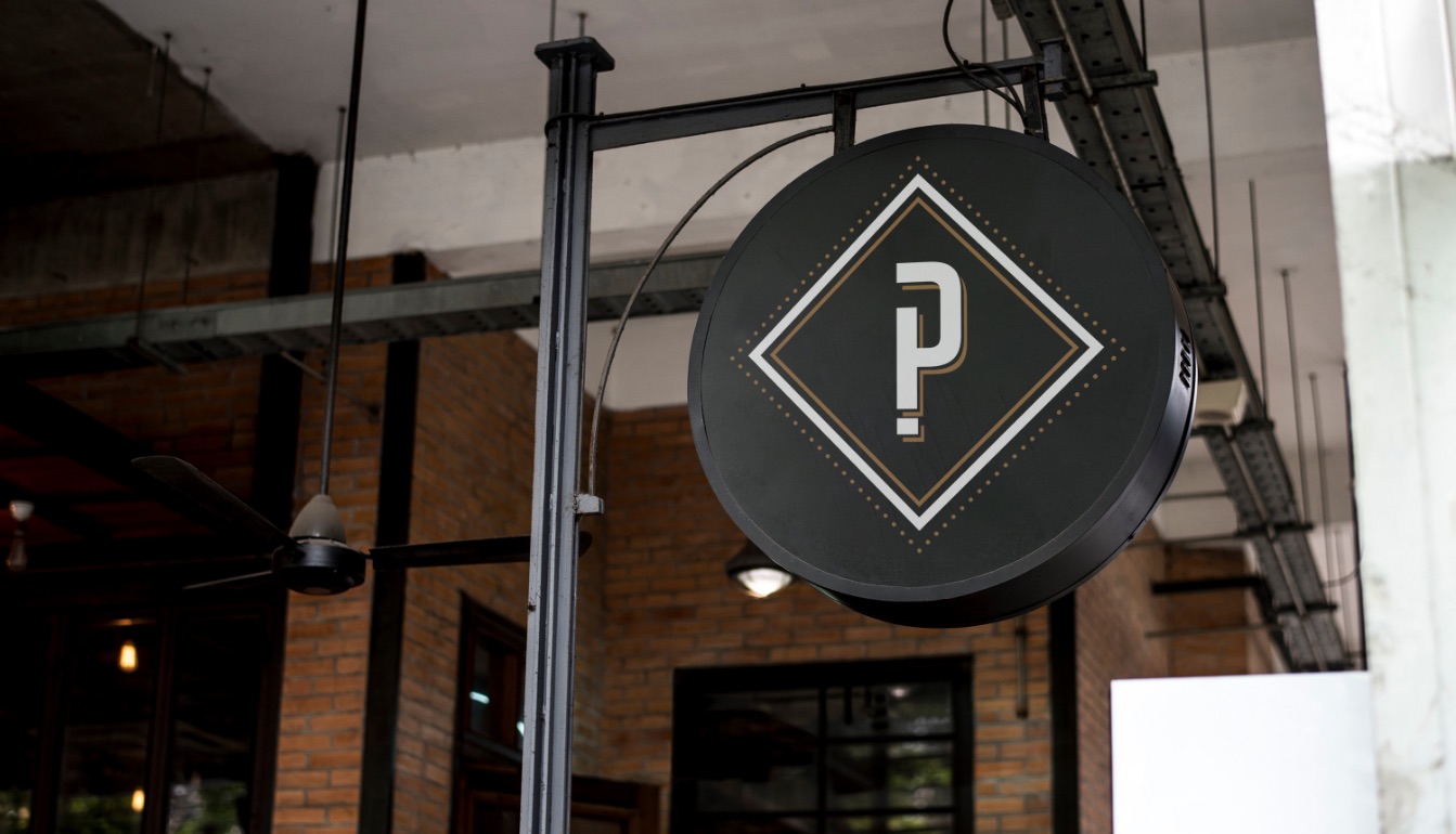
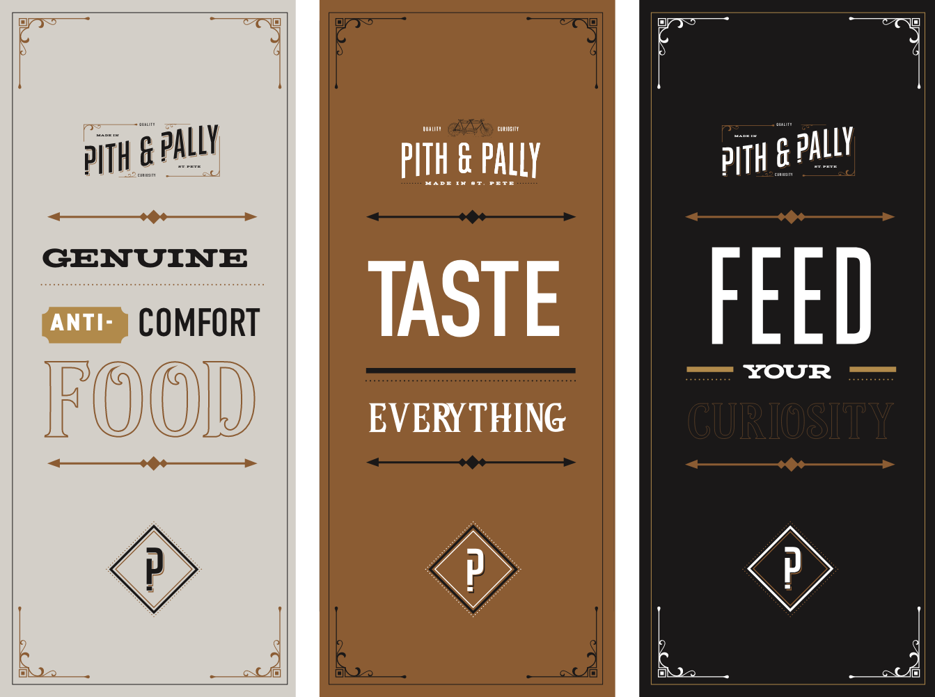
I paired old-world craft with a wink. Victorian ornament and engraved type say quality. A question mark hidden in the P says curiosity. Those two words became the brand’s backbone, printed right into the logo.
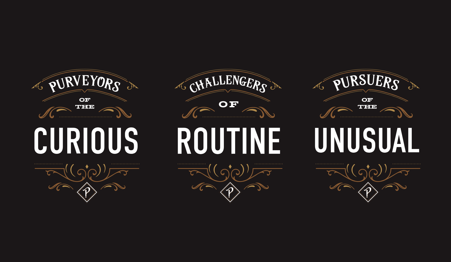
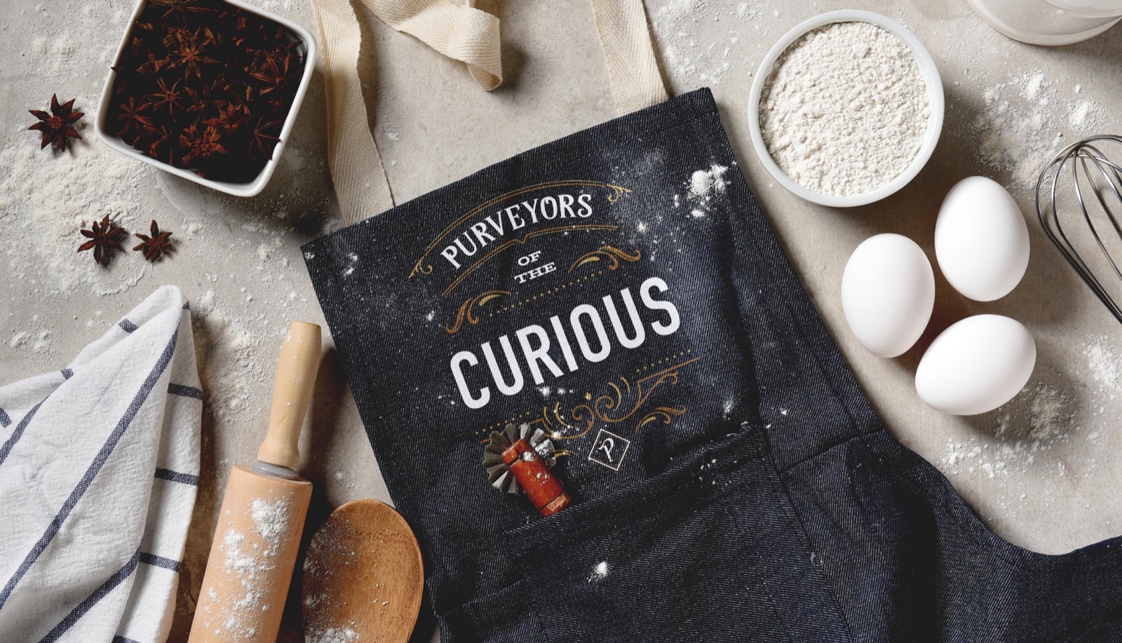
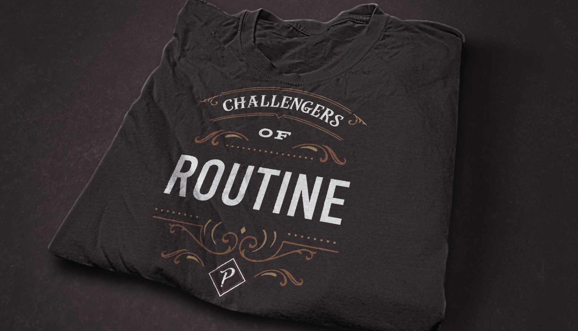
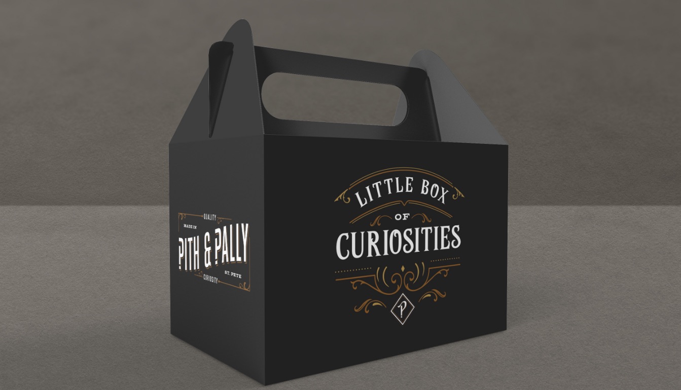
Then every touchpoint got a line to say: aprons, shirts, table tents, the to-go box. Purveyors of the Curious. Challengers of Routine. Genuine anti-comfort food.
Has your company outgrown its brand?
Let’s close the gap between the level you’re playing at and how you show up.