Case study · App brand & interface
InTruth
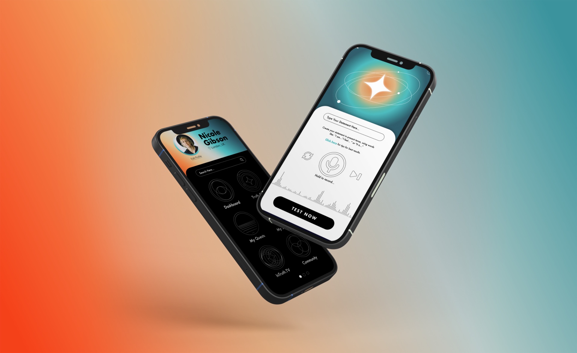
An app that uses muscle testing to help people check their decisions against what they actually believe. The brand had to make an unconventional method feel precise, credible, and worth trusting with something personal.
- Client
- InTruth Technologies
- Industry
- Wellness technology
- Launch
- 2022
- Scope
- Brand identity, app UI, website, launch campaign
The challenge
InTruth sits at an unusual intersection: a body-based practice delivered through a phone. Lean too spiritual and the tech feels flimsy. Lean too technical and it loses the human side.
And it was launching as a counterpoint to the big data platforms that already own people’s attention.
The approach
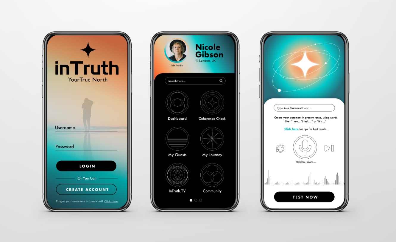
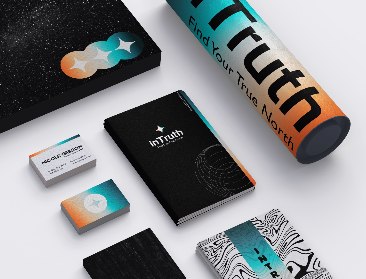
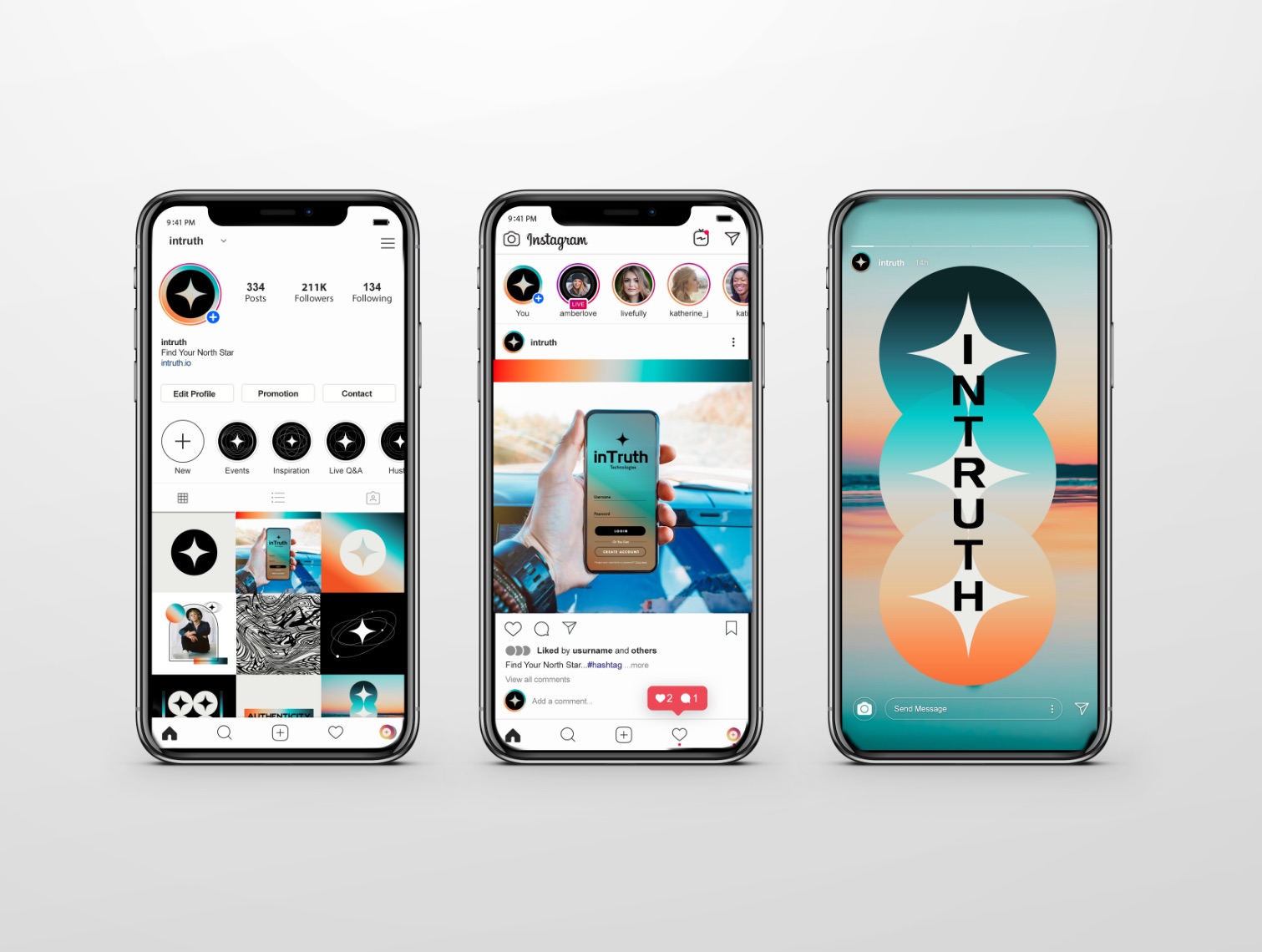
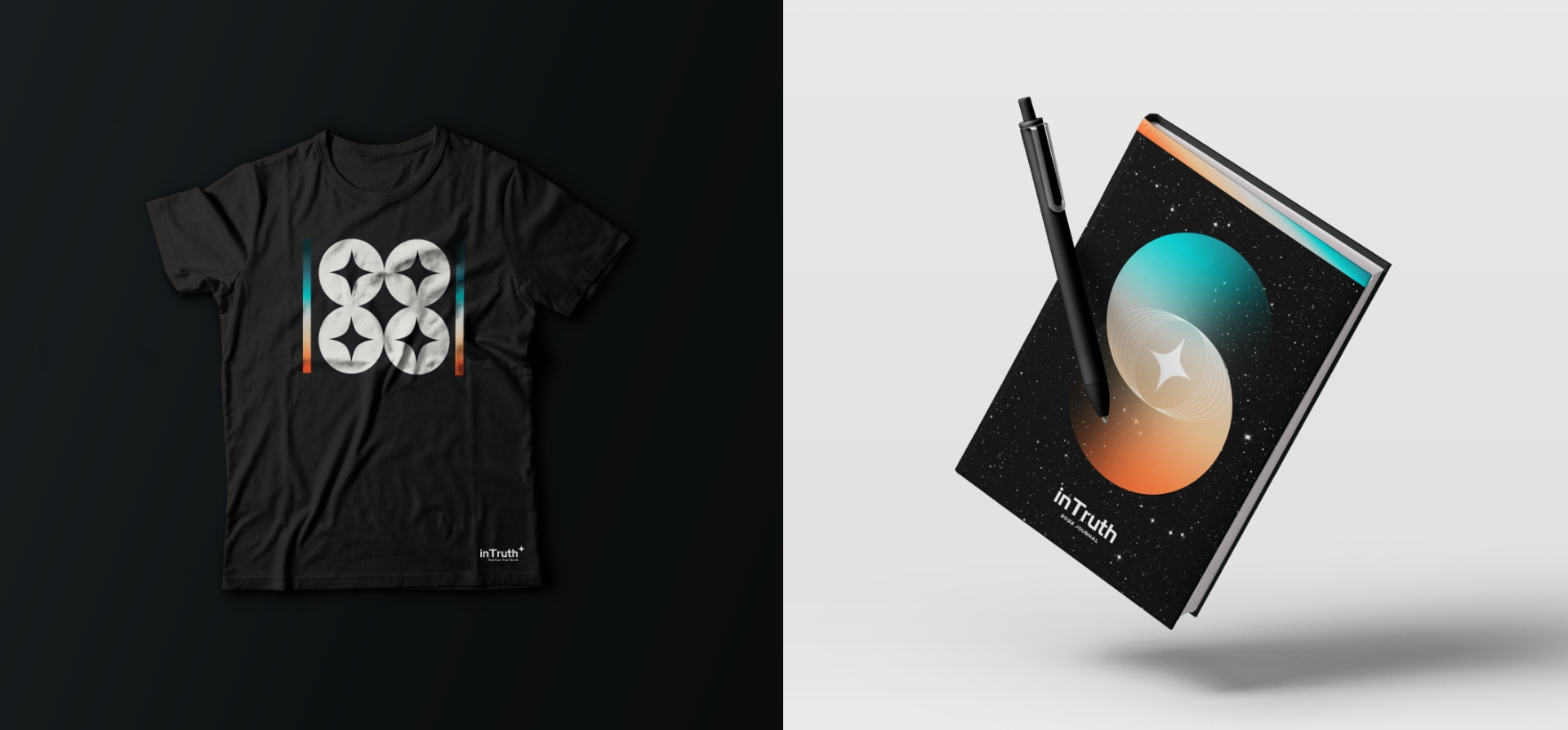
I built the identity around one symbol: a four-point star, a true north to orient by. A sunset gradient from ember orange to deep teal gives it warmth, set against black for precision.
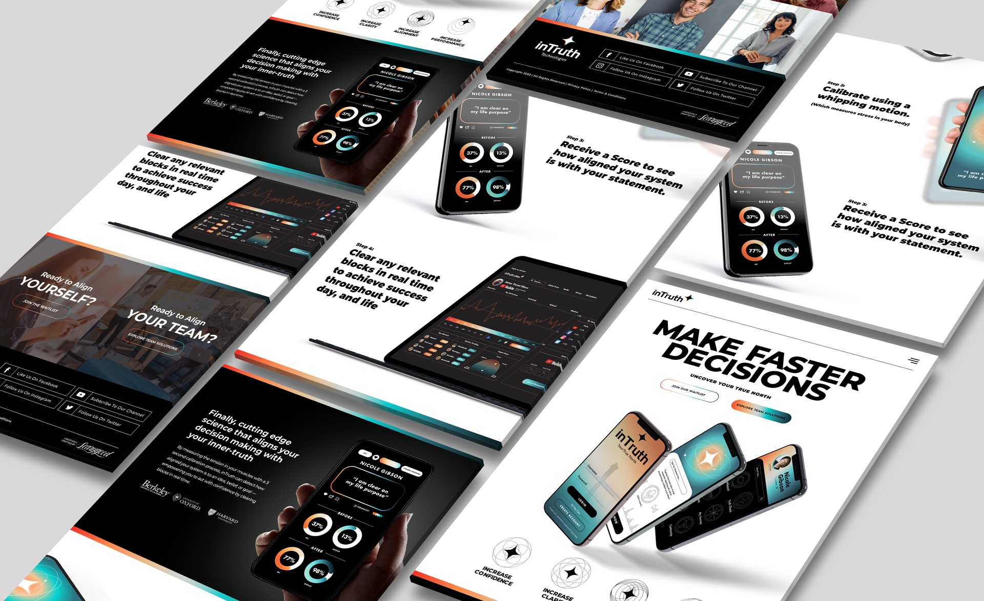
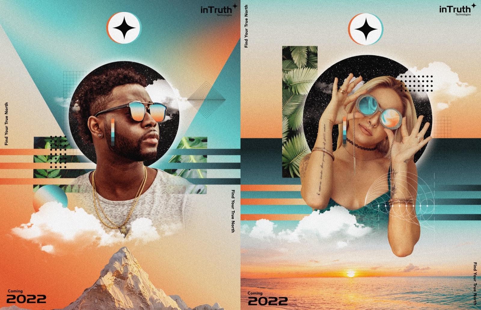
That system carries from the app interface to the website, the launch posters, and a journal that takes the practice offline.
Has your company outgrown its brand?
Let’s close the gap between the level you’re playing at and how you show up.